

CAMPAIGN BRANDING
TKTKTK
WRITTEN BY JAS KEIMIG
PHOTOGRAPHY BY TKTKTK
As tabloids accuse Mayor Katie Wilson of stoking car-owner hatred and greedy billionaires write blubbery cope about the state’s “millionaires tax,” your parents are sending you A.I. fruit slop videos on Facebook. Everything feels impersonal as hell yet, simultaneously, extremely calculated to drive us insane. So it makes sense that, in order to cut through all the noise, one must swing big to capture the zeitgeist’s attention.
That’s what Hannah Sabio-Howell, state senate candidate for Washington’s 43rd legislative district, is doing with her campaign’s visual branding.
The first-time candidate and former comms director for worker advocacy group Working Washington has big plans for the district, which encompasses parts of Downtown, Capitol Hill, First Hill, Madison Valley, U District, Wallingford, and Fremont. She wants to make rent more affordable, enact universal childcare, tax the ultra-wealthy, and make the community safe for vulnerable Seattleites. And, she’s going up against longtime incumbent and Washington State Senate Majority Leader Jamie Pedersen, who has a whole Democratic machine behind him.
Key to rising to the top is having a campaign that can communicate Sabio-Howell’s values to people who catch a glimpse of her signs walking down the street or whilst doomscrolling on Reels. So she teamed up with graphic designer Rob Noland — who has also worked on other progressive campaigns, like Yes On Prop 1 Seattle — to craft a poppy, idiosyncratic visual language for the campaign.
One way they did that was with big bold colors. Noland and Sabio-Howell moved beyond more “traditional” Pacific Northwest colors (blue, green, brown) and beyond red-white-blue Americana, leaning into a more vibrant color narrative: purple, orange, and yellow. All of these hues are still culled from the PNW landscape and Noland named them accordingly: Blue-violet is “Civil Twilight,” yellow is “Golden Sun,” orange is “Alpine Glow,” and the more muted purple is "Prairie Lupine.” Noland and Sabio-Howell didn’t want to think of them as individual colors, rather, a color family working together, much like her campaign.
“Even as we were pressing on and we were getting bolder and brighter with them, I was like, ‘These are still colors that exist around us throughout the year,’” said Noland. “If you’re at the TJ’s at the top of… Cap Hill in the summer, looking out to the Cascades, you're gonna see, quite possibly, Civil Twilight, Golden Sun, and Alpine Glow all at once.”
Other personal pieces of Sabio-Howell come through in her branding. One was the decision to put her first name “Hannah” front and center as a way to make politics and government “feel like something that everyday people can, and should, be a part of and shape,” said Sabio-Howell. The wavy sans-serif font, RL Aqva, used on Sabio-Howell’s signs brings in Seattle’s marine surroundings. And the sun is not only a nod to her Filipina heritage (peep the flag), but also a symbol of the new day ahead.
(LEFT & RIGHT) Diem Chau, Long Braid (2008)
(CENTER) Malayka Gormally, Woman Applying for United States Citizenship at the International Rescue Center in Tukwila (2019)
Public servants in different departments are central to the processes of identifying, paying for, permitting & distributing art across Seattle. This is a great feat of governance.
Pedersen’s two decades of progressive advocacy pose an interesting foil to Sabio-Howell’s campaign. A gay lawyer and former Boy Scout, Pedersen has fought extensively for LGBTQ+ rights, pushed for greater gun control, and, most recently, helped pass the millionaires tax in Olympia. However, Sabio-Howell contends that Pedersen’s values are closer to the center than those of his constituents, and that his incrementalist, compromise-heavy approach doesn’t reflect the urgency with which policymakers should be moving.
In the coming months before November’s elections, Pedersen and Sabio-Howell will likely discuss their ideological differences in official debates and other public fora. For now, Pedersen’s campaign aesthetic doesn’t convincingly refute Sabio-Howell’s allegations that he’s an “old-school Dem”: his branding seemingly takes design cues from the 2004 Kerry/Edwards logo and — to me — is as personable as a toothpaste brand.
In an emailed statement, Senator Pedersen’s campaign said his branding has been “consistent for years, because he’s conveying the same values he’s always had.” The statement traces Pedersen’s experiences growing up gay in Puyallup, where he was bullied and harassed, to his state-level leadership in legalizing gay marriage, organizing protections for trans youth, and other progressive accomplishments.
Pedersen’s consistency, in his campaign’s view, includes his push to enact Washington’s “first-ever taxes on millionaires and the very wealthy.” (This is a point of contention for some progressive voters in his district, as Pedersen did not endorse a statewide payroll tax on big businesses; a form of progressive revenue that, according to Pedersen, lacks sufficient votes in Olympia, though he’d previously vocalized support for the idea.)
“Going back to branding, we wanted to emphasize that consistency, that while the challenges of the day may change, Jamie Pedersen's progressive values do not," his campaign wrote.
(LEFT TO RIGHT) Dennis Allen, Thunderbird and Whale (2004); Dennis Allen, Potlach Gathering (2018); lessLIE SAM, Songs of Salmon People (2018); Trevor Husband, Into the Deep (2022)
As each work of art in the Mayor’s office becomes part of a collective picture of her platform, there emerges an overwhelming idealism that by and large skips over the sheer amount of work it takes to get there.
Seeing personability as a way to cut through the doomscroll-y noise, Sabio-Howell sourced inspiration from her own life to create a “menagerie of puzzle pieces” for Noland to fit together. The creative brief she sent over included pictures of a well-loved yellow hat she wears often, a Jacobin poster in her (rented!) apartment, as well as words like “Seattle hotdog” and “economic populist.” Sabio-Howell also went on a long bike ride through the 43rd and snapped photos of flowers, murals, typography, signs outside small business, and other bits of the district. Everything was fair game.
“I knew there were a few elements that I was really excited about getting to uplift along the campaign trail, which included my family's story — my Filipino family's heritage in particular – and the things that make our community, our district, feel so colorful and vibrant and queer,” said Sabio-Howell.
Of course, there’s the Zohran Mamdani of it all, whose internet-breaking campaign laid the groundwork for how to communicate identity and values through color, design, and font. His campaign for Mayor of New York clearly served as a major inspiration for Sabio-Howell and Noland. In addition to putting his first name front-and-center and pulling inspiration from signs around New York City, Mamdani also employed a similar honey-toned yellow into his campaign.
“I had heard a lot about how his brand was created, also to remind people of things that make them think of New York City,” said Sabio-Howell. “So that's also part of what we wanted to do here: using the symbolism and the feel and the colors that people would recognize — even unconsciously or subconsciously — as Seattle.”
Beyond just connecting her campaign visuals to local landmarks and issues, Sabio-Howell’s use of yellow slides right in with other local progressive candidates’ branding. Katie Wilson incorporated a mustardy variety into her mayoral campaign, a nod to the yellow of the Transit Riders Union, which she co-founded and led for many years. Over in Spokane, progressive candidate Sarah Dixit used a similar spicy yellow, while Pierce County candidate Maricres Castro incorporated a golden yellow in her campaign, also referencing the Filipino flag’s sun symbol.
There’s no progressive design booklet being passed around; but color theory and prior campaigns’ successful practices encourage designs to overlap. That includes commercial campaigns: Noland noted that yellow is a color prominent in a lot of fast food marketing, because it’s been shown to entice hunger in the viewer. It also allows for intense contrast with other colors, allowing messages to float to the front.
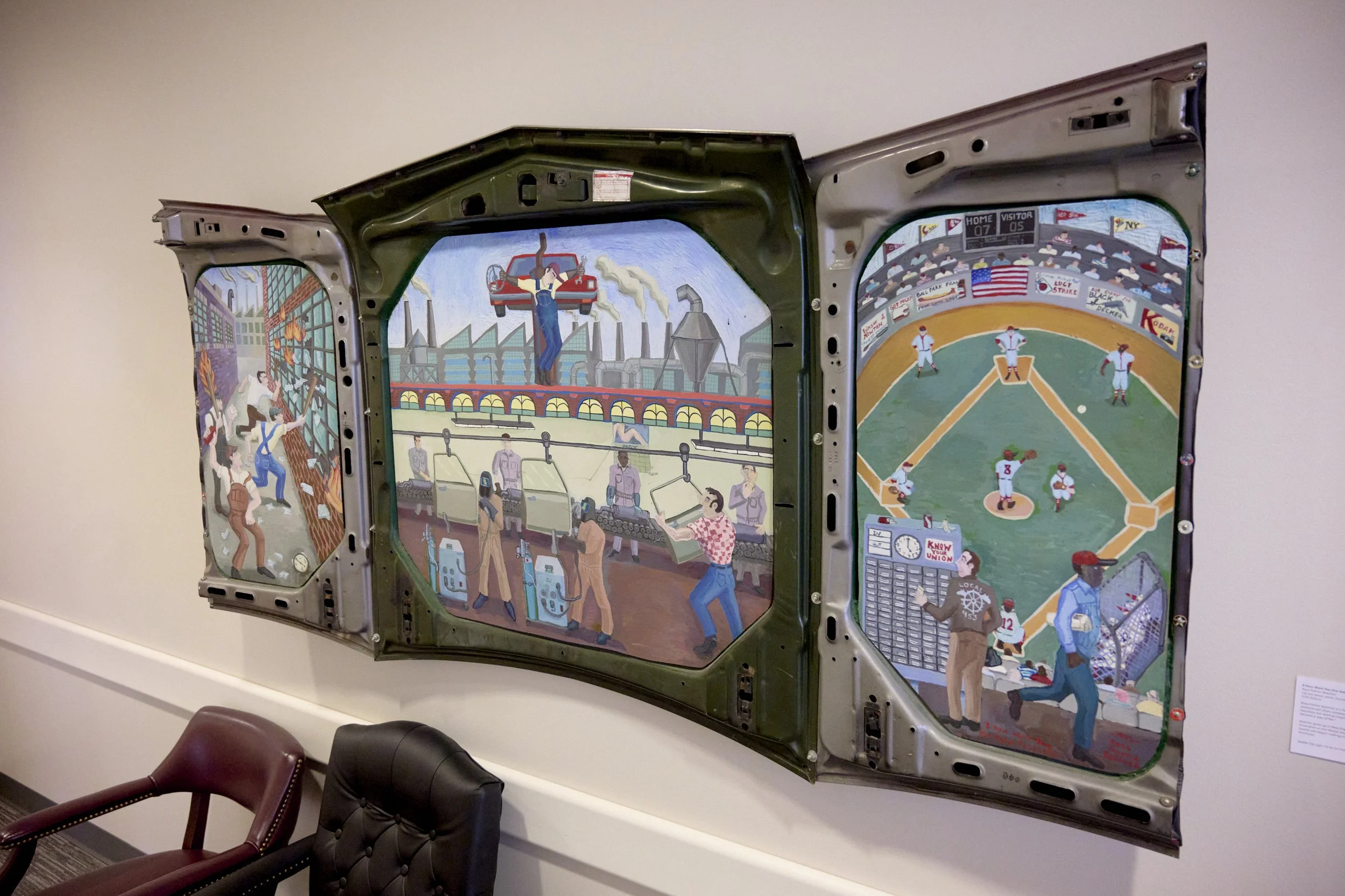
Ross Palmer Beecher, 8 Hour Work Day (For Ralph Fasanella) (1995)
Pedersen had a message of his own when Sabio-Howell announced her candidacy in March. One of many local residents signing Sabio-Howell’s petition to add her name to November’s ballot, Pedersen said he was “happy” to add his signature, as “competition makes democracy thrive.”
The competition has heated up since then. Sabio-Howell’s picked up almost $75,000 in contributions sans PAC funding, and has received the endorsements of lefty local politicians like Councilmember Alexis Mercedes Rinck and State House Representative Shaun Scott, who shares a legislative district with Pedersen, and who authored the payroll-tax proposal that Pedersen did not support. Meanwhile, Pedersen has secured endorsements from major labor unions, and is currently sitting on over $250,000 in campaign funds.
Sabio-Howell says she’s “picking this big fight” to make Seattle “the best place for people to build their lives.” She sees her campaign as “fighting for people’s ability to afford the opportunities they want to seek out.”
To that end, Sabio-Howell’s decision to brand her campaign boldly seems to be resonating, as are her canvassing efforts. Just two weeks ago, at an annual fundraiser for the 43rd legislative district, Sabio-Howell won a straw poll against Pedersen by more than a two-to-one margin. It’s unclear if Pedersen has capitalized on the momentum that incumbency often offers.
Whatever the state election’s final results, prepare yourself for more purple, orange, and yellow throughout the 43rd. November isn’t too far away. As it nears, and with growing frequency, you’ll find the color palette on posters, in flyers, across social media, and at your front door: not just in the deep-hued sunsets and Cascadian skies you can spot from the Trader Joe’s on 17th.
JAS KEIMIG is a writer in Seattle. They are the 2025-26 Black Embodiments Studio apprentice art critic, and regularly contribute to the South Seattle Emerald. Check out their work.